Market Analysis

Read price action, macro forces, and market context without mistaking a story for a signal.

How Is the Gold Price Formed? Four Layers Behind Every Move
Market Analysis

How Is the Gold Price Formed? Four Layers Behind Every Move

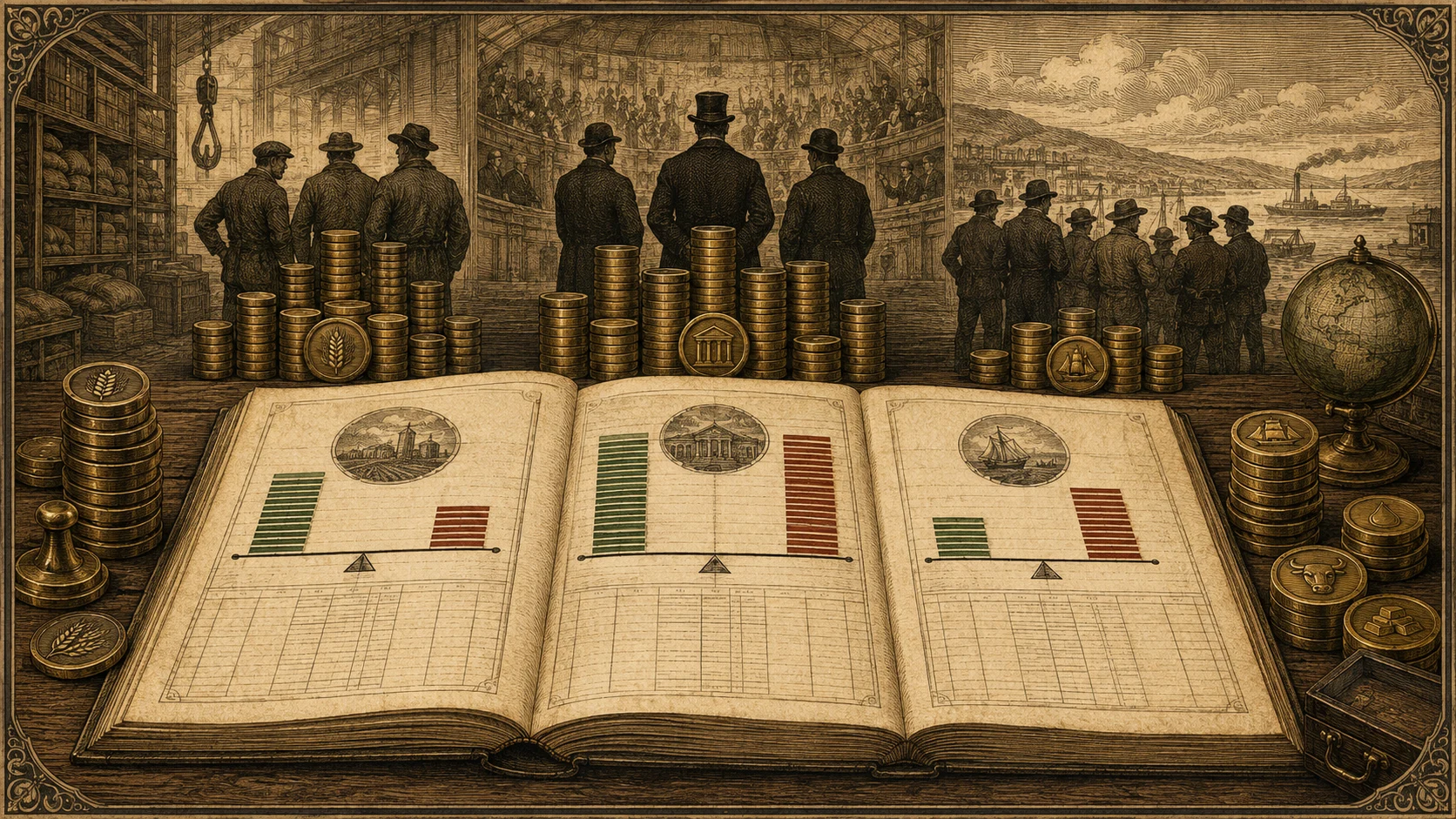
Gold pays no interest, no dividend, and files no earnings — yet the price moves tens of dollars a day. This piece takes the pricing mechanism apart: who actually quotes it, why the stock and not the mine output decides the level, which layer real rates and central banks each control, why your own currency changes your return, and how eight historical episodes test the framework.

Putting the Economic Calendar Into Your Trading Plan
Market Analysis

Putting the Economic Calendar Into Your Trading Plan

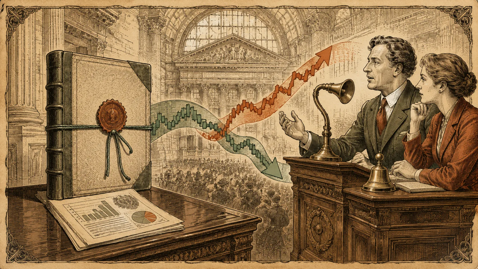
Data releases are scheduled risks — known times when the gap between expectation and reality can reprice everything. How to turn an economic calendar from a news feed into part of a trading plan: what to mark, what to decide before the release, and the three postures for holding through one.

Economic Data Revisions: Why First Estimates Are Drafts, Not Facts
Market Analysis

Economic Data Revisions: Why First Estimates Are Drafts, Not Facts

Headline economic numbers are first drafts. Revisions can reshape a release weeks later — and rewrite the story a market built on it. How the revision process works, why initial estimates are structurally optimistic or stale, and how to trade and hold positions knowing the data underneath can move.

How to Draw a Trendline That Actually Means Something
Market Analysis

How to Draw a Trendline That Actually Means Something

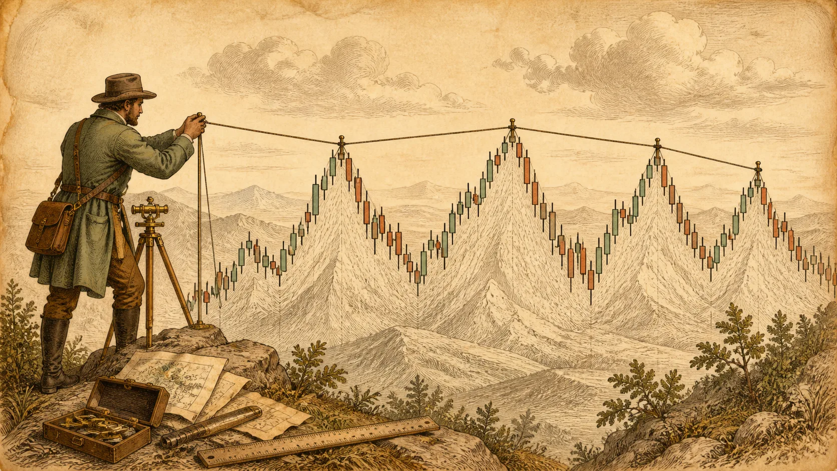
Most trendlines are drawn to fit a story. A working trendline connects real swing points, follows fixed rules for anchors and closes, and is updated only when the structure changes. A step-by-step drawing method, the common mistakes that fake validity, and how to maintain a line over time.


Indicator Overload: When More Signals Mean Less Information
Market Analysis

Indicator Overload: When More Signals Mean Less Information

Stacking indicators feels like adding evidence, but most of them compute from the same closing prices — a chorus, not a witness list. Why overloaded charts create fake confidence and decision paralysis, and how to audit your way back to a chart you can actually explain.

Intraday vs Swing Trading: Same Market, Different Jobs
Market Analysis

Intraday vs Swing Trading: Same Market, Different Jobs

Intraday and swing trading trade the same instruments with completely different jobs: decision frequency, cost structure, chart resolution, and the kind of discipline each demands. A side-by-side comparison to help you pick a lane that fits your time, temperament, and budget.

Leading vs Lagging Indicators: The Trade-Off Behind the Labels
Market Analysis

Leading vs Lagging Indicators: The Trade-Off Behind the Labels

Leading indicators react sooner and lie more often; lagging indicators lie less often and react later. What the two families actually compute, why “learing” is paid for in false signals, and how to use one of each without doubling your evidence.

Logarithmic vs Linear Charts: Which Scale Is Telling the Truth?
Market Analysis

Logarithmic vs Linear Charts: Which Scale Is Telling the Truth?

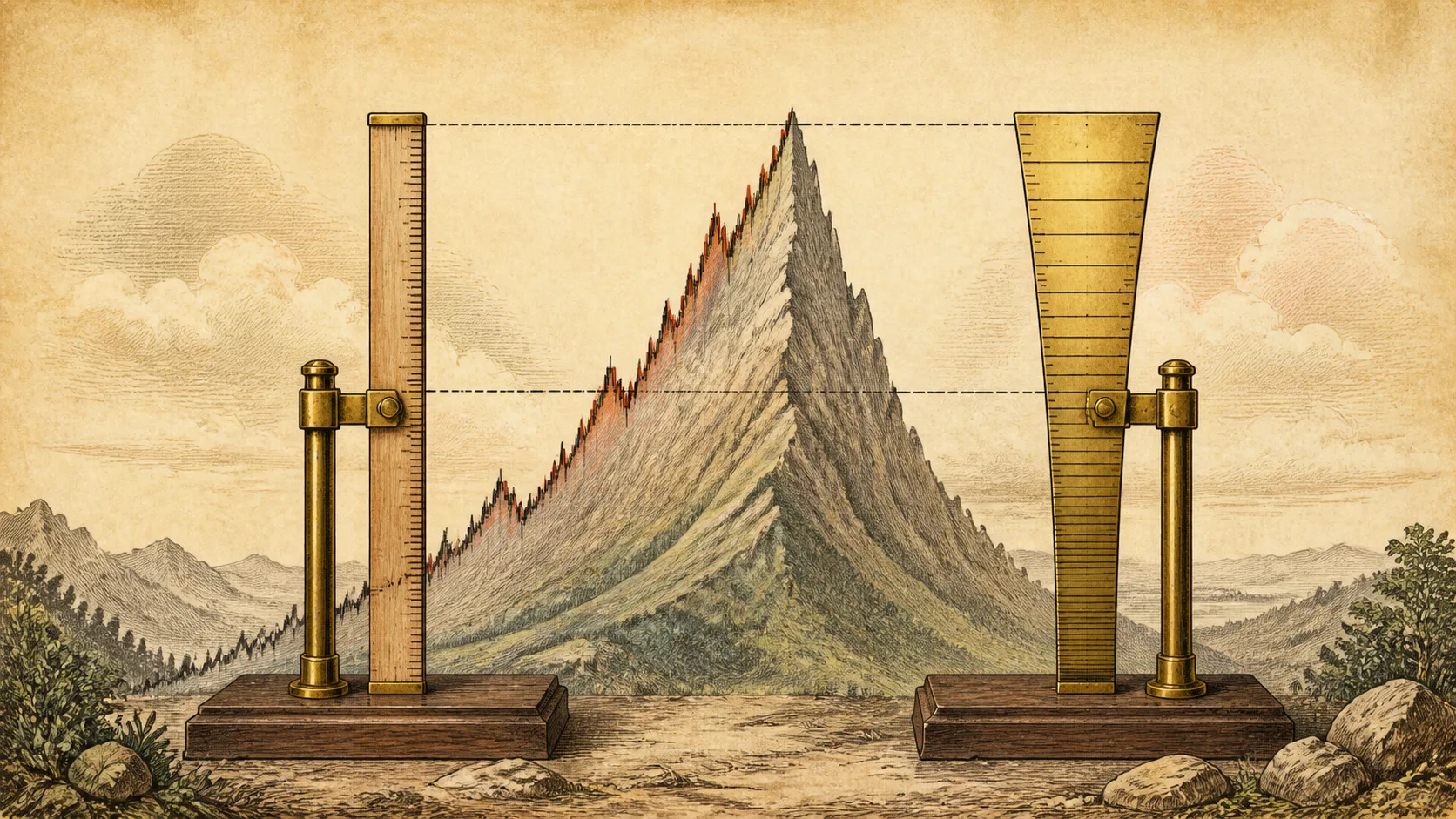
The same price history looks completely different on a linear and a logarithmic chart — and the difference decides whether a long-term trendline means anything. How the two scales work, when each is honest, and how the choice changes trendlines you draw across years of data.

Price Channels: When Two Parallel Lines Describe a Market
Market Analysis

Price Channels: When Two Parallel Lines Describe a Market

A price channel is a trendline plus its parallel twin — two lines that frame where buyers and sellers have agreed to trade. How channels are built, what breaks and rides mean inside them, and the confirmation habits that keep channel trades honest.

Why Good Economic News Can Hurt Markets
Market Analysis

Why Good Economic News Can Hurt Markets

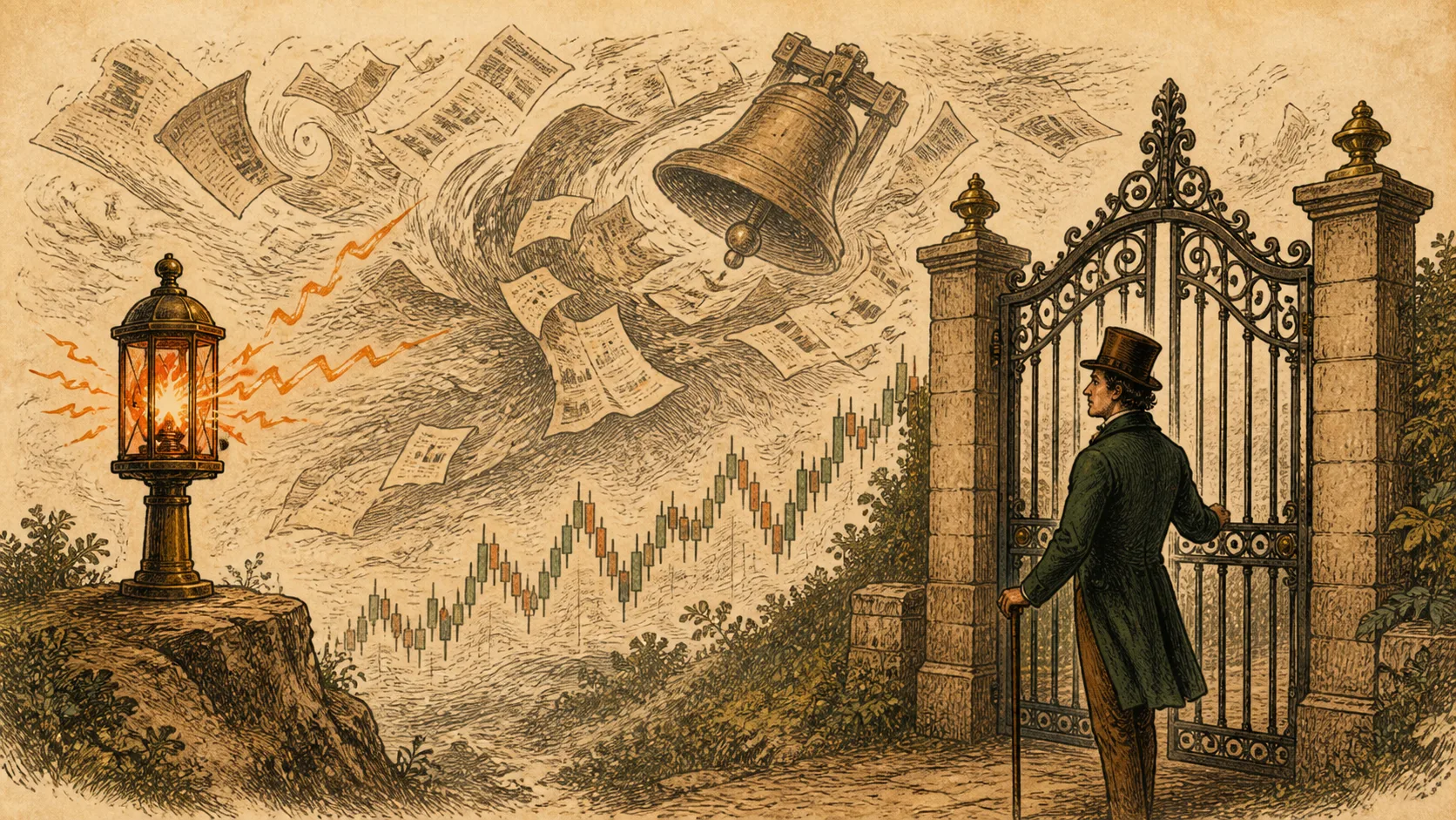
Strong jobs data, booming growth, better-than-expected earnings — and the market falls. The paradox has a mechanical explanation: markets price expectations and the policy response, not the news itself. The four channels through which good news can be bad news for prices.

Why Lower Timeframes Are Harder to Trade
Market Analysis

Why Lower Timeframes Are Harder to Trade

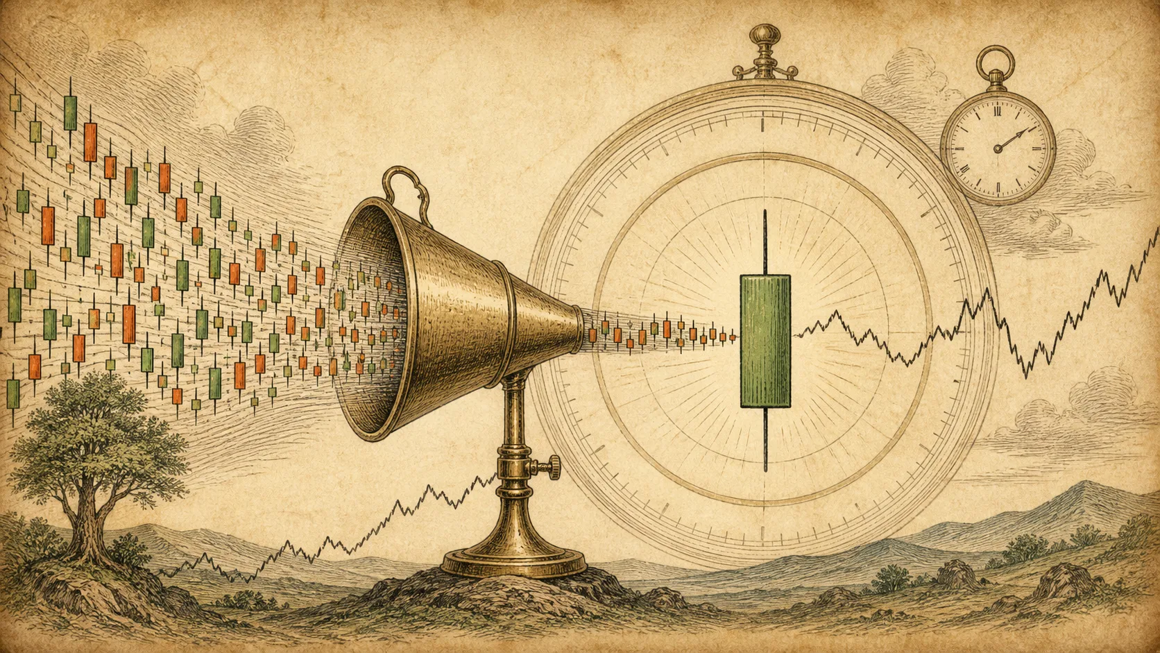
Lower timeframes look easier — more signals, faster feedback, smaller price numbers. In practice they are the hardest charts to trade: noise density is higher, costs take a bigger share of thin targets, and execution demands no slack. Here is the mechanics behind the difficulty.