
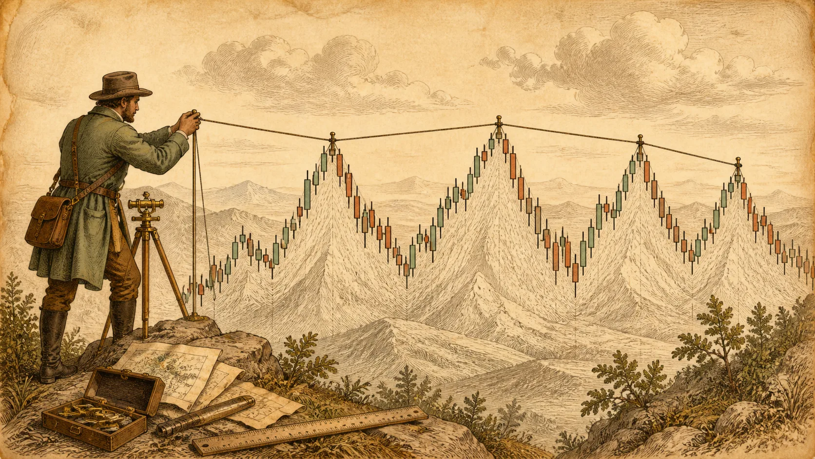
Give the same chart to five traders and you may get five different trendlines — each one connecting the points that support what the drawer already believes. That is the hidden problem with trendlines: they are the easiest tool on the chart to fake, including faking to yourself.
A trendline becomes useful when it is drawn by rules instead of by hopes. This walkthrough covers the anchoring rules, the difference between a line and a proven line, and how to update one without rewriting history.
Draw trendlines by connecting real, obvious swing points — not by aiming at a slope you want. Two points define a line; only a third touch makes it meaningful. Pick one convention (wicks or closes), stay consistent, never bend a line to include a price that broke the old one, and adjust only when a new swing point actually forms. A steep line describes a pace, not a promise.
Step 1: Anchor on real swing points
A trendline earns attention when its endpoints are obvious even to someone who dislikes your trade: clear swing lows in an uptrend, clear swing highs in a downtrend. If you have to hunt for the point that makes the line work, the line is decorative.
Pick one anchoring convention and keep it: bodies (closing prices) or wicks (extremes). Both have defenders; what matters is that you do not switch between them whenever switching makes the line look better. The moment your rule flexes, the line stops measuring the market and starts measuring your mood.
Step 2: Two points draw, three points prove
Two points define a line — and prove nothing. The line only becomes information when price returns to it a third time and respects it, because that is the first moment the line has been tested while anyone was watching.
A third touch after meaningful spacing is a minimum. Beyond that, more respected touches generally build a more-watched line — though they also mean the line is aging, and older steep lines often describe a pace the market has outgrown.
Spacing matters too. Three touches in one dense cluster are weaker evidence than three touches spread across weeks, because the cluster only samples one set of conditions.
| Point | Trading day | Price | Note |
|---|---|---|---|
| Anchor A (1st touch) | Day 5 | $18.20 | First obvious swing low |
| Anchor B (2nd touch) | Day 20 | $19.10 | Second, higher swing low — two points define the line |
| Trendline forecast (extrapolated) | Day 35 | $20.00 | Projected forward from A and B's slope |
| 3rd touch (actual) | Day 35 | $20.05 | Actual low, just $0.05 above the forecast — the line holds |
Numbers are illustrative, used to show how two points define a line and a third touch tests it — they do not represent any real stock's price action.
Anchor A sits at $18.20 on Day 5, Anchor B at $19.10 on Day 20 — those two points fix a slope of $0.06 per trading day. Project that line forward to Day 35 and it forecasts $20.00; the actual low that day was $20.05, just $0.05 (about 0.25%) above the forecast, with price decelerating and bouncing right around that level. That is what a third touch giving the line real information looks like. If Day 35 had instead sliced straight through to $19, the line would have predicted nothing, and there would be no proof to speak of.
Step 3: Let price decide the slope — then read it honestly
The line’s slope is an output, not an input. Drawing first and hunting for touches afterward is how traders manufacture the slope they wanted: a steep line to say “strong momentum,” a gentle line to say “still in the trend.” Place the anchors, then read what you got.
What the slope honestly tells you: very steep lines reflect fast, often unstable phases that rarely last — their breaks usually mean a pace change, not a collapse. Shallow lines describe slower structures and tend to last longer. And a line’s angle on screen is an artifact of chart scaling — compare slopes only on the same chart, same zoom, same scale.
Step 4: Maintain the line without rewriting history
Price will eventually break or overshoot any line. The maintenance rule that separates disciplined drawing from retrofitted drawing: a line updates only when a new swing point forms beyond the old one. Then you redraw from the most recent valid anchor — once, with a note to yourself that the old line failed.
What breaks the rule: quietly dragging the line to whatever point makes the old line “still valid,” so the chart always shows a line that was never broken. A line that is redrawn after every violation is not analysis; it is a diary of hope. Track your redraws — the count itself is a useful honesty metric.
Also keep the line honest relative to structure: a trendline break does not end a trend by itself. The horizontal swing low (in an uptrend) remains the structural boundary; the diagonal only describes the pace. Trendlines are secondary tools around horizontal levels — never a substitute for them.
- My anchors are obvious swing points, not convenient points.
- I use one convention — wicks or closes — and have not switched it mid-chart.
- My line has a third respected touch before I treat it as information.
- I drew the line from anchors and read the slope afterward, not the reverse.
- I update only when a new swing point forms, and I note the old line’s failure.
- I treat the line as a pace guide around horizontal levels, not as a reversal signal by itself.
Frequently Asked Questions
Should I anchor to wicks or to closing prices?
Both are defensible conventions. Wicks capture extremes where supply or demand actually showed up; closes filter temporary spikes. The wrong answer is switching between them whenever it improves the line — consistency is the property that gives the line meaning.
How steep is too steep?
When the slope implies a pace that visibly cannot persist — price climbing at a rate that would be absurd over months. Steep lines are useful while they hold, but expect their break to mark a pace change rather than an instant collapse.
Do trendline breaks mean anything at all?
They mean the described pace has changed — that is genuinely useful information. What they do not mean is automatic reversal: as long as the prior swing low (or high, in a downtrend) holds, structure is intact. Combine the diagonal with horizontal levels before acting.