
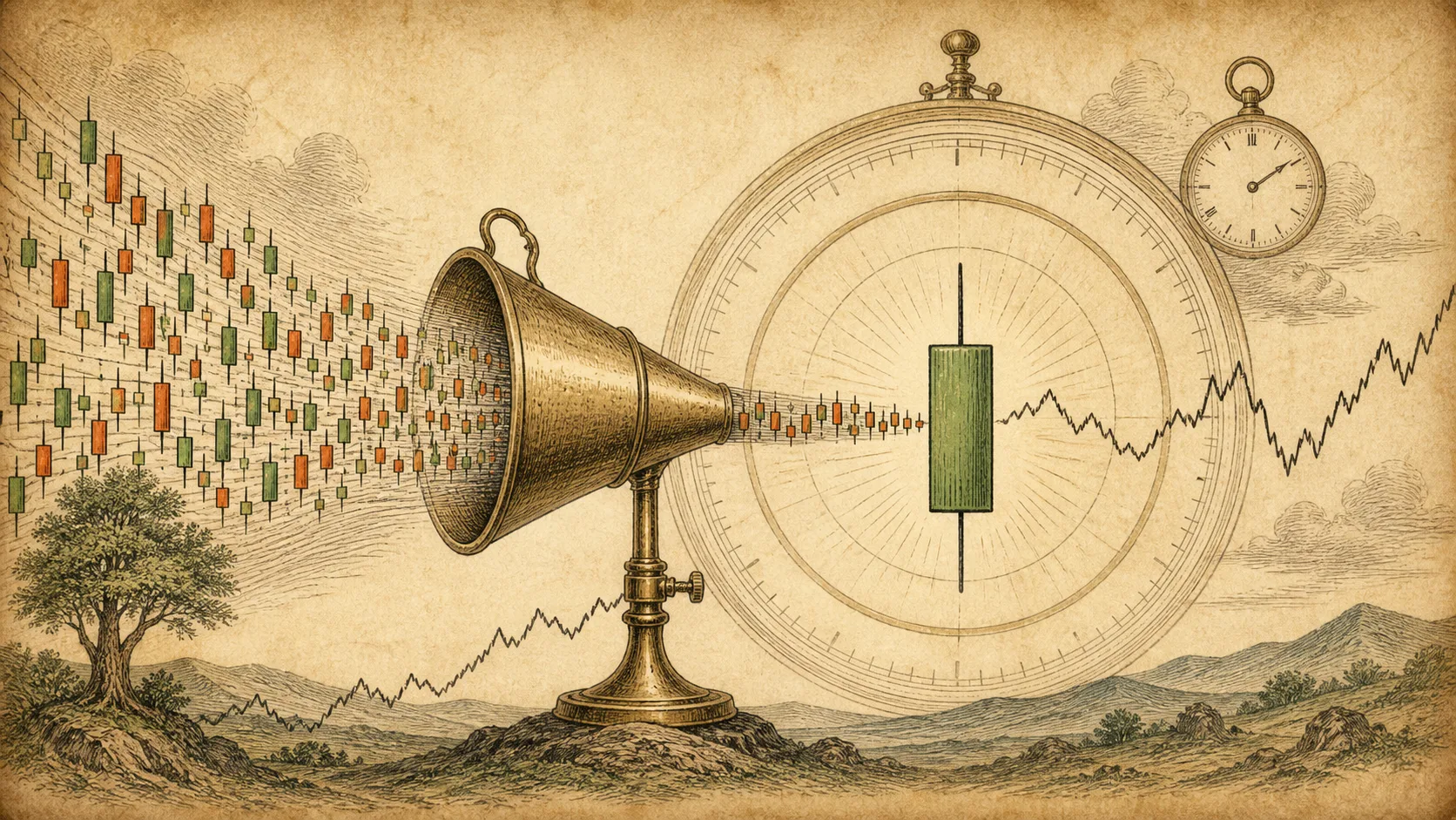
Charts on different timeframes look like different markets. A 5-minute chart crawls; a daily chart summarizes months in a few bars. But the underlying trades are the same; only the aggregation window changes.
Understanding how candles combine across timeframes removes the mystery of 'why the daily and the hourly tell different stories'. They are the same market compressed at different scales.
A longer-timeframe candle is built from the completed trades inside its window, not from the candles of a smaller timeframe. A daily open is the day's first trade, close the day's last, high and low the extreme prices of the whole day. Short candles compose the path; the long candle only keeps the four boundaries.
What Actually Builds a Longer Candle
A 5-minute candle summarizes the trades inside those five minutes. A daily candle summarizes the trades inside the trading day. The daily candle does not need the 5-minute candles to exist; both are summaries of the same underlying trades at different windows.
The open of a daily candle is the first trade of the day, not the first 5-minute open. Its close is the last trade before the market settles, its high is the highest trade of the whole day, and its low the lowest. Everything between is compressed away.
The Path Is in the Short Candles, Not the Long One
The daily candle shows the day's result, not the day's path. To see the path, you switch down: the sequence of 5-minute candles shows how price traveled from open to close, where it stalled, and where it was rejected.
This is why the same four numbers can feel different depending on the timeframe you view. A daily close at 103 after a calm grind to the high reads differently from a daily close at 103 after a violent round trip, but the daily candle alone cannot tell them apart.
| Timeframe | Open | Close | High | Low |
|---|---|---|---|---|
| 5-minute | First trade of the 5 minutes | Last trade of the 5 minutes | Highest in the 5 minutes | Lowest in the 5 minutes |
| Hourly | First trade of the hour | Last trade of the hour | Highest in the hour | Lowest in the hour |
| Daily | First trade of the day | Last trade of the day | Highest of the day | Lowest of the day |
| Session | Open | High | Low | Close |
|---|---|---|---|---|
| Hour 1 (9:30–10:30) | $50.00 | $50.60 | $49.80 | $50.40 |
| Hour 2 (10:30–11:30) | $50.40 | $50.90 | $50.20 | $50.75 |
| Hour 3 (13:00–14:00) | $50.75 | $50.85 | $49.95 | $50.10 |
| Hour 4 (14:00–15:00) | $50.10 | $50.55 | $49.70 | $50.30 |
This day's daily candle is open $50.00, close $50.30, high $50.90, low $49.70. Notice the daily high did not come from Hour 1 or Hour 4, but from Hour 2 in the middle: looking at the daily candle alone, you cannot tell that the day's true high printed well before the close. That is exactly what 'the path is in the short candles, not the long one' means in practice.
The Same Mechanics Repeat at Every Scale
Whether a candle covers five minutes or one month, it records the same four things: the first and last prices, and the extremes. No scale adds new information that was not already in the trades; it only changes how much history each candle compresses.
This is why indicators and patterns computed on different timeframes describe the same market from different zoom levels, not different markets. Context on one scale does not invalidate mechanics on another; it deepens them.
A daily candle and a 5-minute candle describe the same trades through different windows. Use smaller candles to inspect the path and larger ones to frame the context, rather than treating them as conflicting stories.
Using Aggregation in Practice
Start with the larger timeframe to establish context: is price near a major level, inside a range, or in the middle of a trend? Then move down to shorter candles to see the path that produced the last completed bar.
When the timeframes seem to conflict, the resolution is usually found in the path: check whether the smaller candles confirm the larger close, or whether they show rejection the big bar hides.
Frequently Asked Questions
Can I reconstruct a daily candle from the hourly candles?
You can reconstruct the boundaries if the data is complete, but you cannot see the intermediate path from the daily candle alone. That requires the smaller timeframe.
Why do my daily and hourly signals disagree?
They are the same market at different zoom levels. The daily shows the overall result; the hourly shows the path. Conflicts usually resolve by checking the smaller candles.
Does a longer timeframe candle carry more weight?
It carries more history and context, but it is still the same four-price summary. Weight comes from context and structure, not from the candle being 'bigger'.