
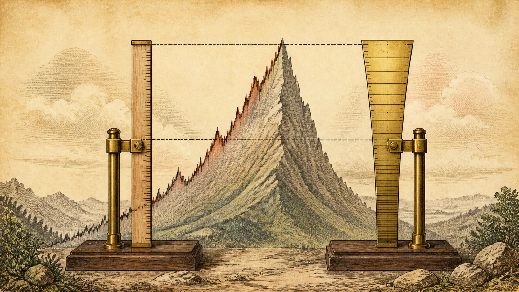
Two traders open the same multi-year chart of the same index. One sees a rocket; the other sees a steady staircase. Neither is imagining things — they are looking at different scales: one where equal price distances take equal space, one where equal percentage moves do.
The scale choice is not a cosmetic toggle. For anything traded across years — or across multiples of price — it decides whether the visual slope of the chart reflects the actual pace of returns.
Linear charts give equal vertical space to equal dollar moves; logarithmic charts give it to equal percentage moves. On short horizons the difference is small. Across years and multiple-fold rallies, linear charts flatten early history into a baseline and exaggerate recent gains, while log charts show each doubling as the same size. Percentage is the language of returns — long-term analysis belongs on log scale, and trendlines drawn across large price ranges mean different things on each.
The two scales in one example
Watch a price travel 10 → 20 → 40. On a linear chart, both legs are $10 moves and take identical vertical space — even though the first was a 100% gain and the second just 50%. On a logarithmic chart, equal vertical space means equal percentage change, so the first leg looks twice as tall as the second — which is exactly how the return feels to anyone who lived through both.
This is the core claim: on a log chart, the same visual distance means the same relative performance. A move from 10 to 11 and a move from 100 to 110 both read as “+10%”, because for a holder they are the same event.
Neither scale lies about the price. They disagree about what is worth measuring — dollars or percentages — and returns, the thing an investor actually earns, are percentages.
| Price move | Point change (linear-chart height) | Percentage gain | Log-chart height (log₁₀ of the ratio) |
|---|---|---|---|
| $10 → $20 | +10 | +100% | 0.301 |
| $100 → $110 | +10 | +10% | 0.041 |
| $100 → $200 | +100 | +100% | 0.301 |
Log-chart height is calculated as log₁₀(price after ÷ price before), used only to show what the two scales are actually measuring — it does not represent any real stock's price action.
A move from $10 to $20 and a move from $100 to $110 both change by +10 points, so a linear chart draws them the same height — but the first is a 100% gain and the second only 10%. The log chart shows that gap honestly: log heights of about 0.301 versus 0.041, a difference of roughly 7.3x. Now flip it around: $10 to $20 and $100 to $200 differ by 10x in points (+10 versus +100), so on a linear chart one bar looks a tenth the height of the other — yet both are +100% gains, and on a log chart their heights are identical. Same history, different ruler, opposite conclusion.
When the choice matters — and when it barely does
On an intraday chart, price rarely travels far from its starting level, and the two scales are nearly indistinguishable. The choice starts to matter on horizons where price has moved a large fraction of its whole range: multi-year stock charts, crypto since launch, commodities across cycles.
On those charts, a linear view compresses everything early into a flat line at the bottom-left and hands all the vertical space to recent prices. The visual message — “nothing happened for years, then everything happened” — is an artifact of scale, not history. The log view shows the early years at their true relative size: some of them were the best percentage gains the asset ever delivered.
A practical rule of thumb: if the chart spans a move of more than about two to three times the starting price, look at it in log before drawing any conclusion about slope or “explosion.”
The same trendline, two different claims
A trendline drawn on a linear chart across a large price range describes a constant dollar pace — the same dollar gain per unit of time. A trendline on a log chart describes a constant percentage pace. These are not the same line, and their projected extensions can diverge dramatically.
Suppose a stock’s log-scale uptrend line connects its major advances at roughly +40% per year. Extended forward, the line rises by smaller and smaller dollar amounts each year — 40% of 20 is 8, 40% of 200 is 80. On the linear chart, the dollar line rising by the same absolute amount every year becomes increasingly demanding relative to the base price. Which extension is “realistic” depends on which pace you believe is being sustained — and that is a substantive question, not a display setting.
This is also why long-term trendlines drawn casually on linear charts tend to “break” in ways that confuse people: the line was measuring dollars in a market that compounds in percentages.
For holding periods beyond a year — or any chart where price has multiplied — look at log scale first, and switch to linear only when you specifically want to think in dollar distances. For short-term charts, either is fine.
- I know which scale the chart is currently on.
- For multi-year views, I have looked at both — and know why they differ.
- Trendlines drawn across large price ranges are interpreted in the scale they were drawn in.
- I remember that equal visual distance means equal dollars (linear) or equal percentages (log).
- My conclusions about “steepness” are not coming from a stretched viewport alone.
Frequently Asked Questions
Which scale do platforms default to?
Most default to linear. Switching to logarithmic is usually one click in chart settings — worth doing on any chart that spans years or multiples of price.
Do I need log scale for short-term charts?
It rarely matters there: within a day or week, price usually stays within a small percentage of its range, so the scales nearly coincide. The divergence grows with the size of the move relative to the price level.
How do I draw a trendline on a log chart?
The same rules apply — anchor real swing points, prove with touches. Just remember what the slope now means: a straight line on log scale represents a constant percentage pace, which is usually the more meaningful description of long-term compounding.