
Horizontal zones and swing pivots represent actual limit order liquidity. They are far more reliable than subjective diagonal lines.
Trendlines Are Diagonal Rulers, Not Market Guardrails
Of all charting tools, the diagonal trendline is the most overhyped and the most deceptive. Many believe that drawing a slanted line forces prices to stay on a physical track, and that breaking it guarantees a catastrophic trend reversal. In reality, lines are human overlays — prices owe zero loyalty to your pencil. In this lesson, we dismantle the visual traps of trendlines.

- Recognize trendlines as subjective diagonal rulers rather than rigid market guardrails.
- Identify the 3 visual trendline traps: retroactive line redrawing, chart-scaling angle distortion, and line breaks misdiagnosed as reversals.
- Synthesize Lessons 11–15 into a robust 5-step charting loop to analyze any market objectively.
Price Paths Are Hard Facts; Trendlines Are Subjective Overlays
Imagine placing a transparent ruler across a photograph of a winding mountain road to connect several peaks. The ruler helps you observe general slope, but when you remove the ruler, the mountain road hasn't changed by a single inch.
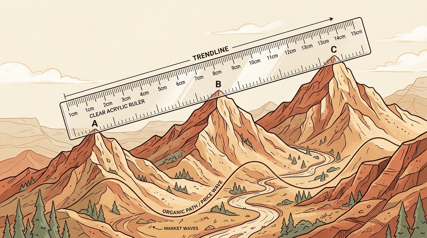
The 3 Visual Traps: Why Beginners Constantly Get Burned by Trendlines
Trap 1 · Retroactive Redrawing
Price broke your trendline? A beginner's natural instinct is to drag the line lower to an even deeper swing low, pretending the line was never violated. A tool that is constantly rewritten in hindsight offers zero predictive discipline or objective risk control.
L1 Initial (Broken) L2 Redrawn Lower (Broken) L3 Forced Line (Hindsight)
Redrawing lines lower after each break renders the tool useless before the fact.
Trap 2 · Chart Scaling Distortion
The exact same OHLC price data presents wildly different visual slopes solely due to changes in viewport aspect ratio (the interactive lab below calculates the live physical angle). Visual slopes are UI artifacts that carry zero independent economic or trading reality.
Viewport Aspect Ratio:Physical Screen Slope: 8° (Looks gentle & slow)
Identical OHLC price data creates 36° physical angle deformation solely from window resizing.
Trap 3 · Line Break != Reversal
When an extremely steep trendline is broken, price is often just shifting from 'rapid rally' to 'moderate advance' or 'consolidation'. As long as the prior horizontal swing low (HL) has not been decisively breached, the overall bullish structure remains intact, and shorting prematurely carries high risk of continuation against you.
Horizontal Key Low HL $100.00 (Solid Support) Steep Diagonal Trendline (Deceleration Only)
Piercing steep line only signals deceleration. Key low HL ($100.00) holds strong.
Watch the Illusion: How Chart Resizing Fools Your Visual Perception
Resize the viewport aspect ratio below to watch how visual trendline angles deform wildly while underlying price data remains 100% static:
Advanced Truth: The Mathematical Divide Between Linear and Logarithmic Scales
Beyond aspect ratio scaling, the coordinate system itself is part of drawing rules. In standard linear scale, equal dollar gains (+$10) take equal vertical height, distorting large rallies into parabolic curves. In logarithmic scale, equal percentage gains (+100%) take equal vertical height. Toggle the coordinate mode below to see how the projected extension price diverges dramatically:
Y-Axis Scale Mode:Log: Equal % gains (+100%) occupy equal height, reflecting true growth rate
Coordinates define drawing rules. Trendline slopes are mathematically meaningless without coordinate context.
From Lesson 11 to 15: The Professional 5-Step Charting Loop
Whenever opening a clean chart, follow this systematic order to eliminate confirmation bias:
- 11. Read 4 Prices (L11) · Understand Net Displacement & WicksInterpret candle body displacement and long wick rejection without elevating isolated single candles into prophecies.
- 22. Select Timeframe (L12) · Higher Timeframe Bias, Lower TimingUse Daily/4H to confirm primary trend direction and headroom; use 15M/5M to locate low-risk pullback entries.
- 33. Classify State (L13) · Identify Swings (HH/HL/LH/LL)Determine whether the market is in an uptrend, downtrend, range-bound consolidation, or unclear.
- 44. Map S/R Zones (L14) · Mark Horizontal Reaction ZonesDraw wide, meaningful support and resistance zones and wait for clear price stabilization or rejection.
- 55. Trendline Rhythm (L15) · Use Trendlines Strictly as Secondary ToolsTreat diagonal lines as pacing guides. Never front-run reversals on broken lines alone without horizontal breakdown.
3 Truths Before Leaving Chart Language
Breaking a trendline does not signal an immediate collapse. True reversal requires a confirmed break of the prior Higher Low (HL).
Seamlessly integrate OHLC mechanics, multi-timeframe perspective, regime classification, and horizontal zone mapping.
Put Your Understanding to the Test
3 capstone questions to test your trendline mechanics and the full 5-step charting system.
Question 1 of 3
In a strong uptrend, price pierces below a 3-week steep ascending trendline, but holds well above the previous swing low (Higher Low). What is the most disciplined reading?
Question 2 of 3
Why does the visual "steepness" of a trendline change dramatically when resizing chart software windows?
Question 3 of 3
In the professional 5-step charting loop, what is the relationship between horizontal support/resistance zones (Lesson 14) and diagonal trendlines (Lesson 15)?
Stuck? Ask Mira to Break It Down
Ask Mira to review any chart using the 5-step framework to identify clean horizontal levels and eliminate subjective drawing noise.
Checking sign-in status...