Why Does the Same Market Look Completely Different on Other Timeframes?
Beginners frequently get tangled in a classic paradox: the Daily chart looks violently bullish, the 5-minute chart looks like a flash crash, and the 1-hour chart is stuck in a chop. Which one should you believe? Are higher timeframes naturally "more accurate"? In this lesson, we demystify timeframe resolution.
~12 minsChart PerspectiveTimeframe Scale Lab
Learning Goals
Understand that timeframes alter observation resolution, not underlying market reality.
Master the mechanics of how shorter-term candles aggregate into higher-timeframe candles.
Resolve multi-timeframe conflict using the rule: higher timeframe sets bias and room; lower timeframe provides timing and risk control.
Dismantling the Hierarchy Myth
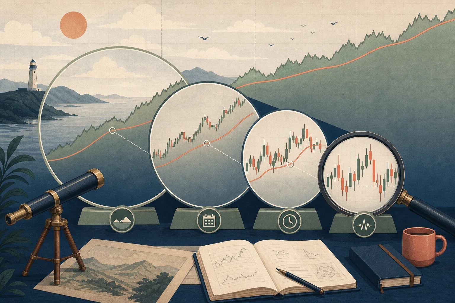
Timeframes Aren't Accuracy Rankings — They're Telescope vs. Microscope
Many beginners believe the Daily chart is somehow "truer" than the 5-minute chart. In reality, there is only one objective stream of executed trades. Different timeframes simply offer different magnification levels:
Three-Lens Perspective on the Same Market Journey
Switch lenses to inspect genuine mathematical OHLC aggregation between microscope, standard lens, and telescope:
Comparing the three interactive lenses above reveals their distinct operational roles and trade-offs:
• 5-Minute Chart (Microscope): High resolution for micro details. Every brief thrust, wick extreme ($108 peak at 09:20, $96 low at 09:35), and stabilization inflection is visible. It is an indispensable tool for pinpointing entry timing and compressing stop distance; however, the chart is full of random noise, making it easy to lose the forest for the trees.
• 1-Hour Chart (Standard Lens): Medium resolution to filter intraday jitter. Twelve choppy 5-minute bars are smoothed into clean swing waves, clearly revealing channels, structures, and reaction zones.
• Daily Chart (Telescope): Low resolution for macro perspective. Instant clarity on dominant multi-month trend and major overhead resistance targets ($120), though hundreds of points of intraday movement are compressed into a single bar.
Compression Mechanics
Aggregation Mechanics: How 12 Five-Minute Bars Form 1 One-Hour Bar
Aggregation Projection: How 12 Five-Minute Bars Form 1 One-Hour Bar
Click the pills below to highlight how each boundary price is extracted from micro swings and projected into the macro candle:
Higher-timeframe candles are strictly aggregated from smaller-timeframe bars. As shown in the diagram above, consider a 1-hour bar synthesized from twelve 5-minute bars: • Open (O): Strictly takes the Open of the 09:00 first bar ($100.00); • High (H): Scans across all 12 bars to capture the absolute peak ($108.00 at 09:20), forming the upper wick tip; • Low (L): Scans across all 12 bars to capture the deepest trough ($96.00 at 09:35), forming the lower wick base; • Close (C): Strictly takes the Close of the 09:55 final bar ($103.00).
The resulting 1-hour candle settles precisely at $O=100, H=108, L=96, C=103$. The higher timeframe looks clean because it preserves the four boundary extremes while packaging away the 12 intermediate back-and-forth swings.
Interactive Scaling
Watch the Compression: How Details Vanish as Time Expands
Switch between different timeframes below using the same simulated price dataset. Observe how noise is eliminated while intermediate paths disappear:
Same Record, Different Time RulerSample data only demonstrating aggregation — not a market signal
How to use it: click 5 minutes, 30 minutes, and 2 hours in turn. Each time, watch how many bars appear on the left, then read the note on the right: fewer bars doesn't mean closer to the future — it just means more of the process got packed together.
What did this observation keep?12 aggregated bar(s)
Keeps more back-and-forth movement and the order of extremes, at the cost of denser information and more frequent watching.
Scale doesn't judge truth. It decides which details you can see, which information gets compressed away, and whether your observation and execution can keep up with it.
Trading Mindset
Resolving Conflicting Signals: Daily Bullish, 5-Min Bearish — Who Wins?
When you see an uptrend on the Daily chart but a sharp drop on the 5-minute chart, they are not contradicting each other: • The Daily uptrend is built from multi-day waves; • The 5-minute decline is simply a healthy intraday pullback within that broader uptrend!
HTFHigher Timeframe (HTF) · Defines Bias & RoomConfirm that the market is in a major bull trend with ample room before major resistance, setting your core bias to "long with trend".
LTFLower Timeframe (LTF) · Refines Timing & RiskWait patiently for the 5-minute pullback to complete and print stabilization signals, compressing your stop distance and maximizing reward-to-risk.
Scenario A · Chasing Solely on Daily Chart
Wide stop loss, mediocre reward-to-risk (1.7 : 1)
Chasing long at current market price $103 targeting $120 (+ $17 reward). But structural daily stop must sit below previous swing low at $93 (- $10 risk). Reward-to-risk is only $17 / $10 = 1.7 : 1, requiring >37% win rate just to break even.
Anchor Daily $120 target, wait patiently for a 5-minute pullback to retest support at $100.50. Enter on stabilization with a stop just below the micro inflection at $99.50 (risk -$1.00, reward +$19.50). Reward-to-risk leaps to 19.5 : 1!